
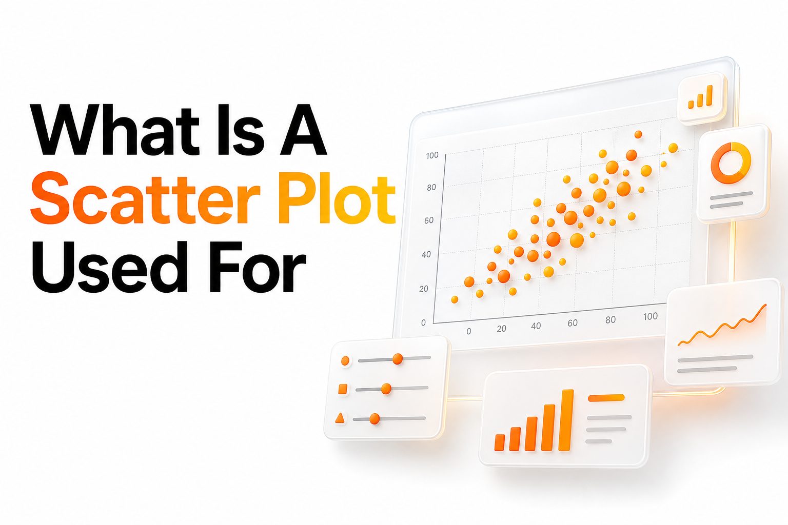
A scatter plot is used to show the relationship between two numerical variables. Each point on the chart represents one observation, with one value placed on the horizontal axis and another value placed on the vertical axis.
The main value of a scatter plot is visual clarity. Instead of reading rows of numbers, readers can quickly see whether two variables move together, move apart, or show no clear connection.
For example, a business may compare advertising spend with monthly sales. A teacher may compare study hours with exam scores. In both cases, the chart helps turn raw data into a visual pattern.
Why Scatter Plots Matter in Data Analysis
Scatter plots help people see relationships that tables often hide. When data points form a clear upward or downward pattern, the viewer can make better judgments about how one variable relates to another.
They are especially useful when decisions depend on trends. A company can review whether higher spending leads to better results, while a researcher can check whether one measurement changes alongside another.
Scatter plots also help reduce guesswork. They do not prove cause and effect alone, but they provide a strong starting point for deeper analysis, testing, and comparison.
Common Uses of Scatter Plots
- Finding relationships between two numerical variables
- Spotting positive, negative, or weak correlation
- Detecting unusual values or outliers
- Comparing real-world observations visually
- Supporting reports, dashboards, and research findings
- Checking whether a trend is linear or uneven
How Scatter Plots Show Relationships
A scatter plot shows a relationship by placing each data pair as a point. When many points follow a similar direction, the viewer can identify a possible connection between the two measured values.
If points rise from left to right, the variables may have a positive relationship. If points fall from left to right, the relationship may be negative. If points appear scattered randomly, the connection may be weak.
This makes scatter plots useful for quick pattern recognition. They help analysts, students, marketers, and researchers see whether two variables deserve closer attention before applying advanced statistical methods.
Positive Correlation in Scatter Plots
Positive correlation appears when higher values on one axis tend to match higher values on the other axis. The points usually move upward from left to right, creating a clear rising pattern.
A simple example is study time and test performance. If students who study longer generally receive higher scores, the scatter plot may show a positive trend across the data points.
Businesses also use this pattern often. If higher customer satisfaction scores align with higher repeat purchases, a scatter plot can help show that connection clearly and support future planning.
Negative Correlation in Scatter Plots
Negative correlation appears when one variable increases while the other tends to decrease. The points often slope downward from left to right, showing an opposite movement between the two measurements.
For example, a scatter plot may compare product price with units sold. If higher prices usually lead to fewer sales, the chart may show a downward pattern across the data.
This type of visual can guide practical decisions. It helps teams notice tradeoffs, such as cost versus demand, workload versus productivity, or speed versus error rate.
Weak or No Correlation in Scatter Plots
Sometimes data points do not follow a clear direction. They may appear spread across the chart without forming a strong upward or downward pattern, which suggests weak or no visible relationship.
This result is still useful. It tells the analyst that the two variables may not be closely connected, or that other factors may be affecting the outcome more strongly.
For example, a company might compare employee age with customer ratings. If the points are widely scattered, age may not be a useful factor for explaining rating differences.
Scatter Plot Patterns to Watch
Positive pattern
Data points move upward from left to right. This suggests that higher values in one variable are often linked with higher values in the second variable.
Negative pattern
Data points move downward from left to right. This suggests that higher values in one variable are often linked with lower values in the second variable.
No clear pattern
Data points are widely spread without direction. This suggests that the variables may not have a strong visible relationship.
Clustered pattern
Points appear in separate groups. This may show different segments, categories, behaviors, or hidden patterns within the data.
Outlier pattern
One or more points sit far away from the rest. These values may reveal errors, rare cases, or important exceptions.
Scatter Plots for Finding Outliers
Scatter plots are very helpful for finding outliers. An outlier is a data point that sits far away from the general pattern, making it easy to notice visually.
Outliers matter because they can change averages, distort conclusions, or point to special cases. A single unusual value may represent a data entry mistake, a rare event, or a meaningful exception.
For example, one store may have much higher sales than others despite similar advertising spend. A scatter plot can make that difference visible and encourage a closer review.
Scatter Plots in Business Decisions
Businesses use scatter plots to compare performance drivers. They can examine sales against ad spend, customer ratings against retention, or delivery time against complaint rates.
These charts help teams move from opinion to evidence. When patterns are visible, decision-makers can focus on relationships that appear meaningful and ignore comparisons that show little connection.
Scatter plots also support communication. A simple visual can help leaders, clients, and team members see why a strategy may need adjustment based on actual data behavior.
Scatter Plots in Marketing and SEO
Marketing teams use scatter plots to compare campaign metrics. They may review traffic against conversions, ad clicks against revenue, or content length against organic visits.
For SEO work, scatter plots can help compare keyword difficulty with traffic potential. They can also show whether publishing frequency relates to ranking growth or whether backlinks align with search visibility.
For deeper related reading, an internal link can point to a data visualization guide. Another useful internal link can point to SEO analytics basics for readers who want broader reporting context.
Scatter Plots in Education and Research
Teachers and researchers use scatter plots because they simplify numerical comparison. A teacher might compare attendance with grades, while a researcher might compare age with reaction time.
In academic work, scatter plots often appear before statistical testing. They give researchers an early view of whether a relationship is worth measuring with correlation, regression, or other methods.
They also make findings easier to communicate. Readers who may not know advanced statistics can still interpret the overall shape, direction, and spread of the data.
Scatter Plots in Healthcare and Science
Healthcare professionals may use scatter plots to compare measurements such as blood pressure and age, exercise time and weight change, or treatment dosage and patient response.
Scientists use them to review experimental results. A scatter plot can show whether a variable changes consistently under different conditions, helping researchers evaluate patterns before drawing conclusions.
These charts are especially useful when data includes variation. Real-world measurements rarely line up perfectly, and scatter plots show both the trend and the natural spread around it.
When to Use a Scatter Plot
Use a scatter plot when both variables are numerical. The chart works best when each observation has two measurable values, such as income and spending or temperature and energy usage.
Scatter plots are also useful when you need to check direction, strength, and spread. They help reveal whether a relationship is strong, weak, consistent, grouped, or affected by unusual values.
Avoid using a scatter plot for categories alone. If you are comparing product types, regions, or survey choices without numerical pairs, a bar chart or column chart may work better.
When Scatter Plots Work Best
- Both variables are numbers
- Each point represents one observation
- The goal is to compare two measurements
- You need to see trends or correlation
- Outliers may affect the result
- A table feels too dense for quick reading
- You want to support analysis with a visual
Scatter Plot Versus Line Chart
Scatter plots and line charts can look similar, but they serve different purposes. A scatter plot shows individual data points, while a line chart usually shows values connected in sequence.
Line charts are often better for time-based trends, such as monthly revenue or daily temperature. They show movement over time and help readers follow a continuous timeline.
Scatter plots are better for relationships between two variables. They do not require time order, and the spacing between points can reveal patterns that a line chart might hide.
Scatter Plot Versus Bar Chart
A bar chart compares categories, while a scatter plot compares numerical pairs. If the goal is to compare sales by region, a bar chart is usually clearer.
If the goal is to compare sales with advertising spend, a scatter plot is more useful. It shows how two measured values move together across multiple observations.
Choosing the right chart keeps the message clear. A scatter plot should not replace a bar chart when categories are the main focus, and a bar chart cannot show correlation well.
How to Read a Scatter Plot
Start by looking at the axes. The horizontal axis shows one variable, and the vertical axis shows the other. Their labels explain what each point represents.
Next, study the direction of the points. A rising shape may suggest positive correlation, a falling shape may suggest negative correlation, and a random spread may suggest little visible connection.
Finally, look for clusters and outliers. Groups may reveal segments in the data, while isolated points may need further review before making a final decision.
Key Parts of a Scatter Plot
Chart title
The title should clearly describe the comparison. A useful title tells readers what two variables are being compared without making them guess.
Horizontal axis
This axis usually holds the independent or input variable. It should have a clear label and measurement unit where needed.
Vertical axis
This axis usually holds the outcome or response variable. It also needs a clear label and consistent scale.
Data points
Each point represents one observation. The position of the point shows the paired values for that observation.
Trend line
A trend line can show the general direction of the data. It should support the visual pattern without hiding individual points.
Best Practices for Creating Scatter Plots
Good scatter plots start with clean data. Missing values, duplicate records, and incorrect measurements can make the chart misleading, especially when the dataset is small.
Axis labels should be clear and specific. Instead of using vague labels like “Value A” and “Value B,” use names such as “Monthly Ad Spend” and “Monthly Sales.”
Keep the design simple. Heavy colors, unnecessary gridlines, and crowded labels can distract from the pattern. The goal is to make the relationship easy to read.
Adding a Trend Line to a Scatter Plot
A trend line helps summarize the general direction of the data. It can make a positive, negative, or flat relationship easier to see, especially when many points are displayed.
However, a trend line should be used carefully. If the data is curved, grouped, or heavily affected by outliers, a straight line may oversimplify the pattern.
A trend line is most useful when it supports the visible data shape. It should clarify the relationship, not replace careful review of the actual points.
Mistakes to Avoid with Scatter Plots
One common mistake is assuming correlation means causation. A scatter plot can show that two variables move together, but it cannot prove that one directly causes the other.
Another mistake is ignoring outliers. Unusual points may affect the trend line or change the overall interpretation, so they should be checked before presenting conclusions.
Poor scaling can also mislead readers. If an axis is stretched or compressed too much, the relationship may appear stronger or weaker than it really is.
Practical Scatter Plot Examples
A sales team may compare calls made with deals closed. If more calls generally align with more deals, the chart can support activity targets and coaching plans.
A website owner may compare page speed with conversion rate. If slower pages tend to convert less, the scatter plot can help support technical improvements.
A product team may compare feature usage with customer renewal. If frequent users renew at higher rates, the visual pattern can help guide retention strategy.
Scatter Plot Benefits for Reports
Scatter plots make reports more useful because they show relationships quickly. Readers can see patterns without reading every number in a table or spreadsheet.
They also help reports feel more evidence-based. A chart gives context to claims about performance, behavior, growth, or risk, making the analysis easier to trust.
For dashboards, scatter plots can support fast review. Executives and analysts can scan relationships, notice unusual points, and decide where deeper investigation is needed.
Limitations of Scatter Plots
Scatter plots are powerful, but they have limits. They work best with two numerical variables and may become harder to read when too many points overlap.
They can also be misread when the viewer expects proof of cause and effect. A visible relationship may be influenced by hidden factors that are not shown in the chart.
Another limitation is visual clutter. Large datasets may need transparency, color grouping, filters, or interactive tools to keep the chart readable and useful.
How Scatter Plots Support Better Decisions
Scatter plots help people make better decisions by showing evidence in a visual form. They turn abstract numbers into patterns that are easier to compare and discuss.
They also help teams ask better questions. Instead of assuming a relationship exists, analysts can use the chart to check whether the data supports that idea.
The best decisions come from combining the chart with context. A scatter plot points toward possible relationships, while domain knowledge and further analysis help confirm what the pattern means.
Conclusion
A scatter plot is a practical chart for comparing two numerical variables, showing patterns, spotting outliers, and judging whether a relationship appears strong, weak, positive, or negative. When used with clean data and clear labels, what is a scatter plot used for becomes easy to answer through real visual evidence.
FAQ
What does a scatter plot show
A scatter plot shows the relationship between two numerical variables. Each point represents one observation, helping readers see patterns, trends, clusters, and outliers that may not be obvious in a table.
When should I use a scatter plot
Use a scatter plot when you want to compare two measurable values. It is useful for checking correlation, reviewing trends, finding unusual points, and supporting analysis with a clear visual format.
Can a scatter plot prove causation
No, a scatter plot cannot prove causation by itself. It can show that two variables may be related, but further testing and context are needed to confirm whether one variable directly affects another.
What is a trend line in a scatter plot
A trend line is a line added to show the general direction of the data points. It helps summarize the relationship, especially when the overall pattern is visible but slightly spread out.
Why are outliers important in scatter plots
Outliers are important because they can reveal errors, rare cases, or meaningful exceptions. They may also affect averages, trend lines, and final conclusions, so they should be reviewed carefully.
0 Comments