
Scatter Plot Maker
Plot paired quantitative data on true numeric X and Y axes
Scatter Plot Maker
Data Visualization
Build a Scatter Plot Visually
Experiment with point size, color, and grid visibility in a live chart preview.
Chart Controls
See What Your Data Is Really Saying
Discover Data Relationships
Reveal correlations, clusters, and outliers that are hard to spot in tables.
Find Trends Faster
Move from spreadsheet columns to visual insight with a focused workflow.
Visualize Complex Information
Plot multiple groups, labels, and variables without cluttering your chart.
Create Presentation Ready Charts
Export clean visuals for reports, dashboards, lessons, and stakeholder decks.
Create Better Scatter Plots
Upload Data
Import CSV-ready datasets and structure variables quickly.
Customize Points
Axis Controls
Chart Styling
Export Options
Responsive Charts
Labels & Legends
Easy Sharing
Create A Chart In Four Steps
Upload your data
Start with CSV data or paste values directly.
Choose variables
Select your X and Y fields for instant plotting.
Customize visualization
Adjust colors, labels, axes, legends, and groups.
Export your chart
Download crisp visuals for reports and presentations.
Built For Every Data Story

Students

Researchers

Marketers

Business Analysts

Teachers

Data Scientists
Control Every Detail Without Slowing Down
Fine-tune colors, labels, axis ranges, data grouping, point opacity, and chart styling from one clean workspace. Scatter Plot Maker gives teams the visual control of advanced software with the speed of a browser tool.
- Brand-ready color palettes
- Custom labels and legends
- Precise axis and scale controls
- Grouped data comparisons
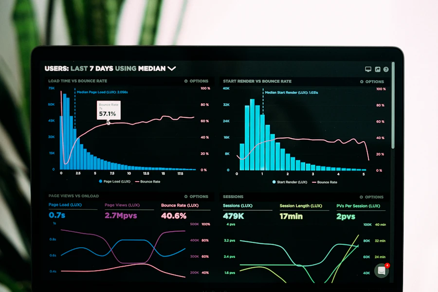
Start From Proven Scatter Plot Templates
Sales vs Revenue
Age vs Income
Marketing Spend vs Growth
Temperature vs Energy
Study Hours vs Results
Why Choose Scatter Plot Maker?
Teams Use It To Explain Data Clearly

Scatter Plot Maker helped our team turn messy campaign data into a clear executive story.
Maya ChenGrowth Analyst
I use it for classroom datasets because students can focus on interpretation, not chart setup.
Daniel BrooksStatistics Teacher
The exports are clean enough for research posters and stakeholder presentations.
Priya RamanResearch Associate
Fast customization saves us hours compared with building every plot manually.
Marcus LeeBusiness Intelligence Lead
The template flow is perfect when I need a polished chart before a client meeting.
Elena TorresMarketing Strategist
It gives our analysts a shared chart style without needing heavy visualization software.
Noah WilliamsData Operations ManagerLatest Blog And Guides
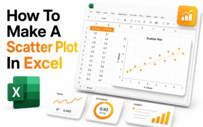 Chart Basics
How to Make a Scatter Plot in Excel
A scatter plot is one of the clearest ways to compare two sets of numerical data. It helps show...
Read More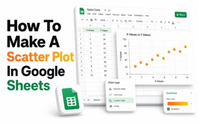 Analysis
How to Make a Scatter Plot in Google Sheets
A scatter plot helps show the relationship between two sets of numeric data. In Google Sheets, it...
Read More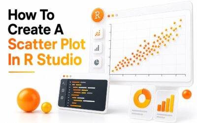 Design
How to Create a Scatter Plot in RStudio
A scatter plot is one of the simplest ways to compare two numeric variables. It helps show...
Read MoreCommon Questions
It is an online tool for creating scatter charts that show relationships between two numeric variables.
Upload or paste your data, choose X and Y variables, customize the chart, then export it.
Yes, CSV files are ideal for quickly importing structured datasets.
Yes, you can adjust colors, labels, axes, point styles, legends, and export settings.
You can start creating charts for free, with premium options for advanced exports and templates.
Yes, the workflow is designed for beginners while still supporting professional chart control.
Yes, charts can be exported for reports, presentations, lessons, and dashboards.
Scatter plots work best with paired numeric values, such as spend and revenue or hours studied and results.
Start Creating Better Data Visualizations Today
Use Scatter Plot Maker to turn your next dataset into a clear, compelling visual in minutes.
Secure, browser-based workflow for modern data teams