
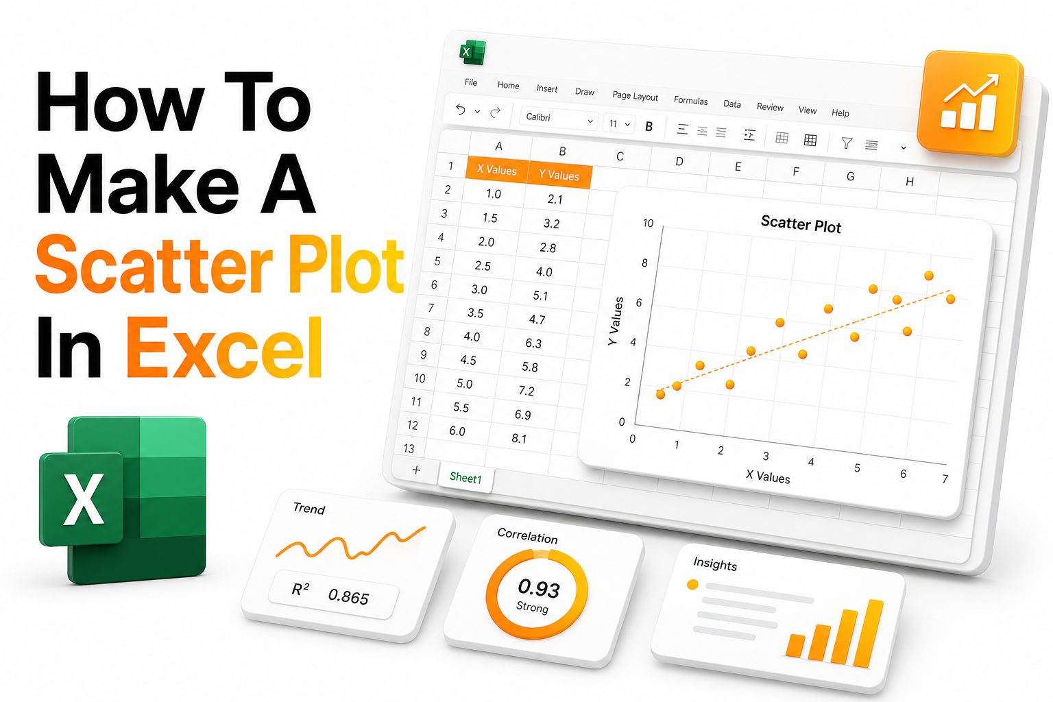
A scatter plot is one of the clearest ways to compare two sets of numerical data. It helps show whether values move together, drift apart, or form patterns that a table alone may hide from view.
Excel makes this chart type accessible for everyday users, analysts, students, marketers, and business teams. Once your data is arranged correctly, the chart can be created in a few clicks and refined for a polished report.
This guide explains how to make a scatter plot in Excel using practical steps, clean formatting, and useful chart features. You will also learn when scatter plots work best and how to avoid common chart mistakes.
Why Scatter Plots Matter in Excel
Scatter plots are useful when you want to compare two numerical variables. For example, you may compare advertising spend with website visits, product price with sales volume, or study time with test scores.
Unlike bar charts or line charts, scatter plots focus on relationships between paired values. Each point represents one record, making it easier to see clusters, outliers, and possible trends across the full dataset.
A well-built scatter plot can turn raw numbers into a clear visual story. It helps readers grasp patterns faster, especially when the chart includes helpful labels, axis titles, and a clean design.
When to Use a Scatter Plot
A scatter plot works best when both columns contain numeric values. One column usually represents the independent variable, while the other represents the dependent variable affected by the first one.
You can use scatter plots for business reporting, scientific data, finance analysis, education results, customer behavior, and performance tracking. They are especially useful when you need to compare cause, effect, or correlation.
Scatter plots are not ideal for category-heavy data, such as product names without related numbers. If your goal is to compare totals by category, a bar chart or column chart may be more suitable.
Quick checklist before creating the chart
Use two numeric columns with related values.
Place the X-axis data in the left column and Y-axis data in the right column.
Remove blank rows that may interrupt the chart range.
Keep column headers short and clear.
Check for text values inside numeric columns.
Review extreme outliers before finalizing the chart.
Preparing Your Data for a Scatter Plot
Good chart results begin with clean data. Before inserting a scatter plot, review your spreadsheet and make sure each row contains a complete pair of values that belong together.
For example, if you are comparing hours worked and project output, each row should include both numbers for the same person, team, week, or campaign. Mismatched rows can create misleading chart points.
It is also helpful to sort or scan your data before charting. Sorting is not always required, but it can help you spot missing values, duplicates, and data entry errors before they appear visually.
Basic Data Layout in Excel
The simplest layout uses two columns. Put the values you want on the horizontal axis in the first column, and place the related vertical-axis values in the second column.
For example, column A might contain monthly ad spend, while column B contains monthly leads. Excel will read the first column as X values and the second column as Y values.
Use a clear header row, such as Ad Spend and Leads Generated. These names help Excel label the chart series correctly and make your chart easier to edit later.
How to Insert a Scatter Plot in Excel
Select the two columns that contain your paired numeric data, including the headers if they are clean and relevant. Avoid selecting unrelated totals, notes, or extra columns that do not belong in the chart.
Next, go to the Insert tab in the Excel ribbon. In the Charts group, choose the Scatter chart icon, then select the basic scatter option with only markers.
Excel will insert the chart into your worksheet. From there, you can resize it, move it, and use the Chart Design and Format tabs to adjust its appearance.
Choosing the Right Scatter Chart Type
Excel offers several scatter chart styles, including markers only, smooth lines, straight lines, and versions with markers. The best choice depends on the purpose of your data.
For most relationship analysis, a markers-only scatter plot is the cleanest option. It shows each data point without implying a continuous path between unrelated records.
Use lines only when the data points have a natural sequence, such as time-based measurements or controlled experiments. For random paired observations, lines may make the chart harder to read accurately.
Formatting the Scatter Plot for Clarity
A default Excel chart often needs formatting before it is ready for a report, presentation, or blog post. Start by adding a clear chart title that describes the relationship being shown.
Next, add axis titles. The horizontal axis should name the X variable, while the vertical axis should name the Y variable. Include units where needed, such as dollars, hours, percentages, or number of leads.
Keep the chart simple. Remove unnecessary borders, reduce heavy gridlines, and avoid bright colors that distract from the data points. A clean chart helps readers focus on the relationship.
Helpful formatting improvements
Use a short chart title that names both variables.
Add axis titles with units of measurement.
Keep gridlines light and subtle.
Use one strong marker color for a single data series.
Avoid 3D effects, shadows, and heavy outlines.
Increase marker size only when points are hard to see.
Adding a Trendline to Show Direction
A trendline helps summarize the overall direction of the data. It can show whether the relationship is positive, negative, flat, or inconsistent across the plotted points.
To add one, select the chart, click the chart elements button, and choose Trendline. You can also right-click a data point and select Add Trendline from the context menu.
A linear trendline is the most common option for basic analysis. It is useful when you want to show whether one variable generally rises or falls as the other changes.
Using R-Squared and Equation Options
Excel lets you display the trendline equation and R-squared value on the chart. These options are helpful when your audience needs more detail about the strength of the relationship.
The R-squared value shows how closely the data points fit the trendline. A value near one means the points follow the line closely, while a lower value means the relationship is weaker.
Use these details carefully. They can support analysis, but they do not prove that one variable causes the other. Correlation can be useful without being treated as final proof.
Customizing Axis Scales
Axis scales affect how readers interpret a scatter plot. If the scale is too wide, patterns may appear weak. If it is too narrow, small differences may look too dramatic.
To adjust an axis, right-click it and choose Format Axis. You can set minimum and maximum bounds, change major units, and control how numbers appear on the chart.
Choose scale settings that represent the data honestly. The goal is to make patterns visible without exaggerating the relationship or hiding important differences between points.
Handling Outliers in a Scatter Plot
Outliers are points that sit far away from the rest of the data. They may reveal important cases, unusual behavior, measurement errors, or one-time events worth checking.
Do not remove outliers without a clear reason. First, review the source data and confirm whether the value is accurate. A typo or missing decimal can distort the chart dramatically.
If an outlier is valid, consider labeling it or mentioning it in the chart notes. In many reports, outliers are not mistakes but important signals that deserve attention.
Adding Data Labels the Right Way
Data labels can make a scatter plot easier to read when you need to identify specific points. However, too many labels can quickly make the chart crowded and confusing.
Use labels only for key points, such as the highest value, lowest value, strongest performer, or unusual outlier. This keeps the chart clean while still adding useful context.
If you need many labels, consider using a separate table beside the chart. You can also use interactive filtering in Excel to let readers focus on selected records.
Working With Multiple Data Series
A scatter plot can compare more than one data series. For example, you may compare sales performance across two regions or customer behavior across several product groups.
To add another series, right-click the chart and choose Select Data. Then add a new series name, X values, and Y values from the correct ranges in your worksheet.
Use different marker colors or shapes for each series. Keep the number of series reasonable, because too many groups can make the chart harder to read.
Color and Marker Choices
Color should support meaning, not decoration. Choose colors that separate groups clearly and remain readable in presentations, printed reports, and shared documents.
Markers should be large enough to see but not so large that they overlap heavily. If many points appear close together, reduce marker size or use lighter colors.
Avoid using many similar shades for different series. When possible, pair color with marker shape so the chart remains readable for people viewing it in grayscale.
Common Scatter Plot Mistakes
One common mistake is selecting the wrong data range. If Excel includes totals, notes, or unrelated columns, the chart may display points that do not belong.
Another mistake is using a line chart instead of a scatter plot. A line chart treats the horizontal axis differently, which can misrepresent numeric relationships between paired values.
Poor labeling is also a frequent issue. Without clear titles, axis names, and units, readers may see the pattern but miss the meaning behind the chart.
Practical examples of scatter plot use
Compare ad spend with generated leads.
Analyze employee training hours and productivity scores.
Review product price and monthly sales volume.
Measure temperature and energy usage.
Compare delivery time with customer satisfaction.
Track study hours and exam results.
Evaluate website traffic and conversion rate.
Creating a Scatter Plot From Filtered Data
Filtered data can help you create a focused scatter plot. For example, you may want to view only one region, product category, time period, or customer segment.
Apply the filter to your table first, then select the visible data range. In many Excel versions, charts respond to filtered rows and update when filters change.
This approach is useful for dashboards and recurring reports. You can build one chart and then use filters to review different parts of your dataset without rebuilding everything.
Using Excel Tables for Better Chart Management
Converting your data range into an Excel Table can make chart management easier. Select your data, then use the table option from the Insert tab.
Excel Tables expand automatically when you add new rows. This means your scatter plot can update more easily as new data becomes available in the table.
Tables also make formulas, sorting, and filtering more consistent. If you create charts often, this simple step can save time and reduce range selection errors.
Making the Scatter Plot Presentation Ready
A presentation-ready scatter plot should be readable at a glance. Use a descriptive title, clean spacing, and consistent formatting that matches the rest of your report.
Increase font size when the chart will appear on slides. Axis numbers and titles that look fine on your screen may become hard to read during a presentation.
Before sharing, check the chart at the final size. Resize it, review labels, and confirm that the pattern remains clear without needing extra explanation.
Exporting and Sharing the Chart
Excel charts can be copied into Word, PowerPoint, emails, and reports. You can paste them as editable charts or as images, depending on your sharing needs.
If the audience may need to edit the chart, keep it linked or embedded as an Excel object. If the chart is final, an image can preserve formatting more reliably.
For web content, export the chart as a clear image and add concise surrounding text. A chart works best when readers know what data it shows and why it matters.
Internal Resources for Excel Users
If you create spreadsheet reports often, an Excel chart formatting guide can help you keep visuals consistent across dashboards, presentations, and client files.
You may also benefit from an Excel data cleaning guide before building charts. Clean data reduces chart errors and makes your analysis more dependable from the start.
Strong Excel visuals usually come from a simple workflow: prepare the data, choose the right chart, format with care, and review the final result from the reader’s point of view.
Advanced Tips for Better Scatter Plots
For dense datasets, consider using transparency on markers. This helps reveal areas where points overlap and makes clusters easier to see without adding extra chart elements.
You can also use helper columns to create smarter labels or group colors. This is useful when you want certain points to stand out based on category, status, or performance level.
If your data changes regularly, build the scatter plot from a structured table and keep formulas separate from raw input columns. This makes updates cleaner and easier to audit.
Scatter Plot SEO and Content Use Cases
Scatter plots are valuable for blog content because they turn data claims into visual proof. A chart can support case studies, research summaries, industry comparisons, and performance reports.
When using a scatter plot in content, explain the main takeaway near the image. Readers should not have to inspect every point to understand the chart’s purpose.
Use descriptive image filenames and alt text when publishing charts online. For example, a file name based on the chart topic is more useful than a generic screenshot name.
Conclusion
Learning how to make a scatter plot in Excel gives you a practical way to compare two numerical variables and present patterns clearly. With clean data, the right chart type, useful labels, and careful formatting, a basic spreadsheet can become a strong visual analysis tool.
The most important steps are simple: prepare paired numeric values, insert a scatter chart, add titles, adjust axes, and use trendlines only when they support the message. A clear scatter plot helps readers see relationships, spot outliers, and make better decisions from data
0 Comments