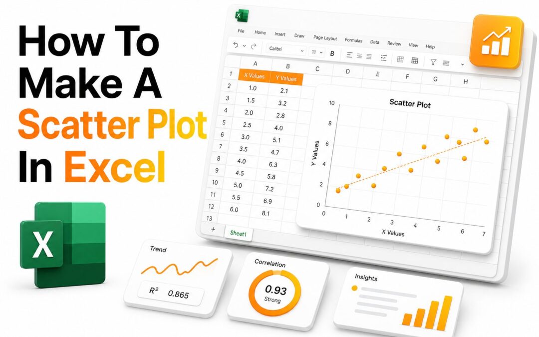
 A scatter plot is one of the clearest ways to compare two sets of numerical data. It helps show whether values move together, drift apart, or form patterns that a table alone may hide from view. Excel makes this chart type accessible for everyday users, analysts,...
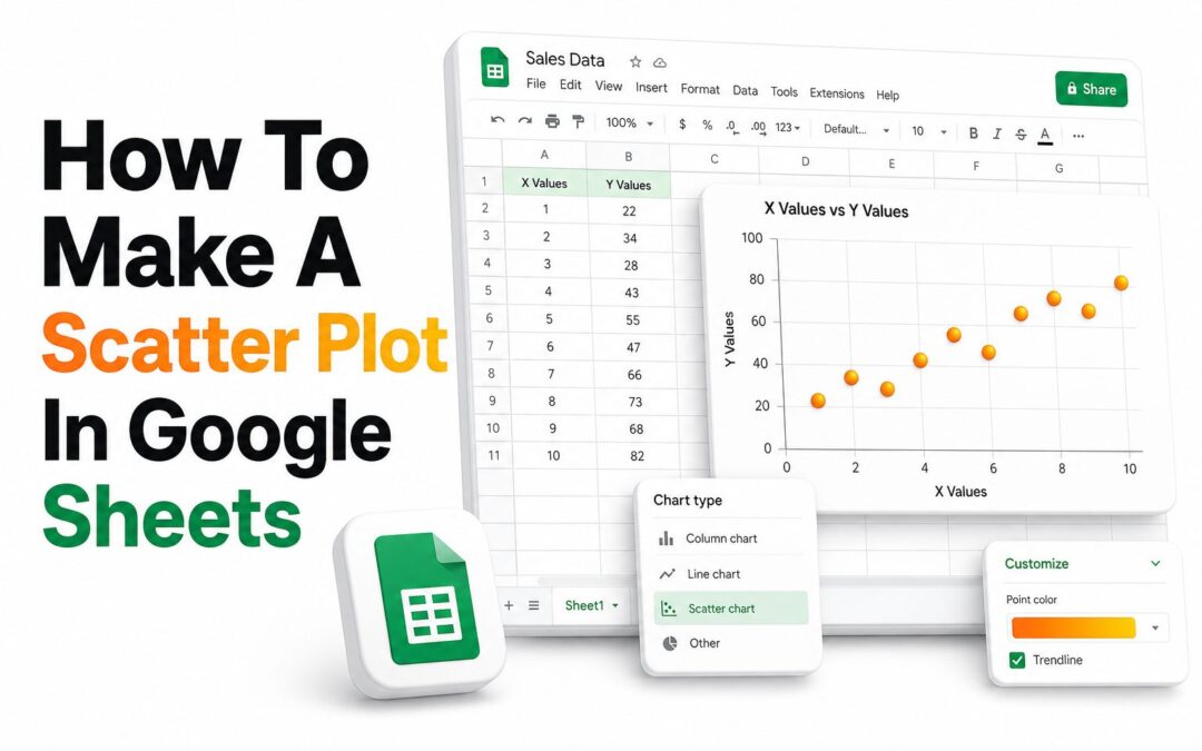 A scatter plot helps show the relationship between two sets of numeric data. In Google Sheets, it is useful for comparing values such as sales and ad spend, study time and test scores, or price and demand. The chart works by placing one variable on the horizontal axis...
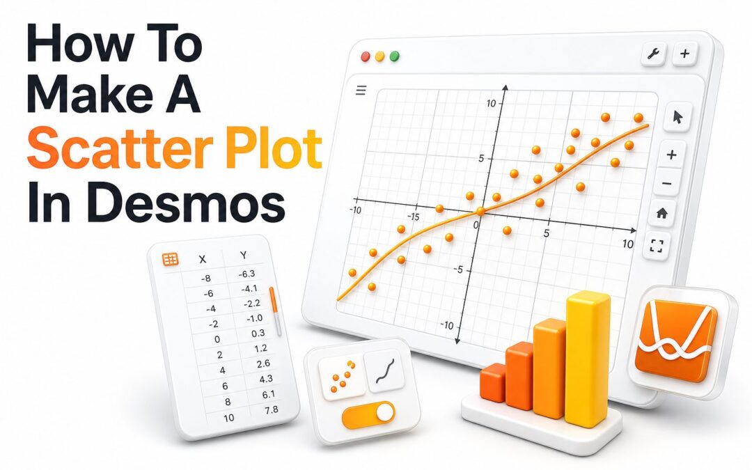 Desmos is one of the easiest graphing tools for turning raw data into a clean visual. If you need to compare two variables, a scatter plot helps show patterns, clusters, gaps, and possible relationships without complicated software. Learning how to make a scatter plot...