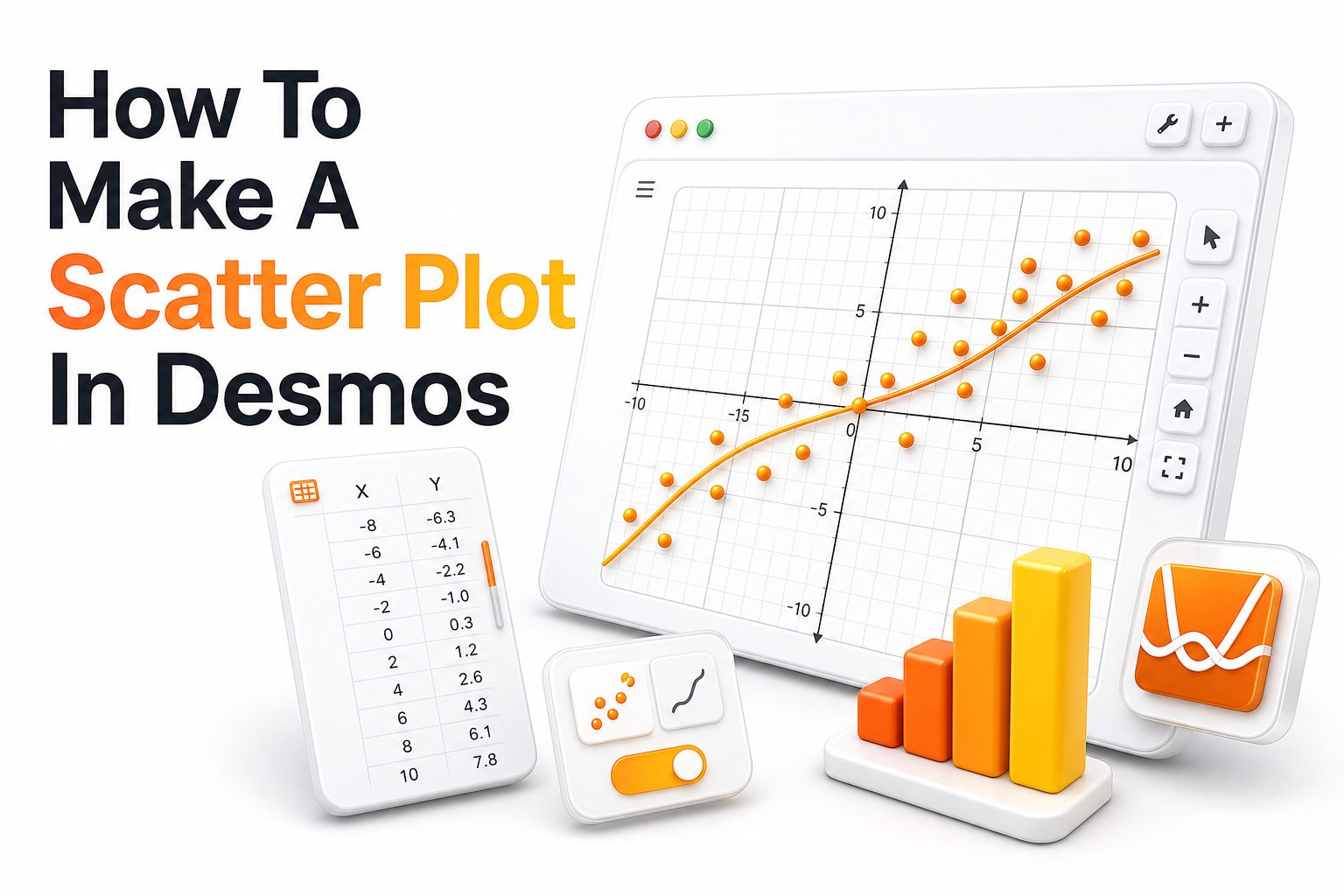
Desmos is one of the easiest graphing tools for turning raw data into a clean visual. If you need to compare two variables, a scatter plot helps show patterns, clusters, gaps, and possible relationships without complicated software.
Learning how to make a scatter plot in Desmos is useful for students, teachers, researchers, and anyone working with simple data. The process is quick because Desmos lets you enter values directly into a table and see points appear instantly.
A scatter plot works best when each data point has two values. One value goes on the x-axis, and the other goes on the y-axis. Desmos then places each pair as a point on the coordinate plane.
Why Desmos Works Well for Scatter Plots
Desmos is browser-based, free to use, and simple enough for beginners. You do not need to install a program or create an account just to graph points, although an account helps if you want to save work.
The table feature makes scatter plots practical because you can type or paste data into columns. Desmos automatically treats each row as an ordered pair, so the graph updates as soon as your values are entered.
Another reason Desmos is useful is its flexibility. You can change point color, adjust the viewing window, add labels, compare multiple data sets, and create regression models when you want to study trends more closely.
Quick Scatter Plot Checklist
- Open the Desmos Graphing Calculator.
- Add a table from the expression panel.
- Enter x-values in the first column.
- Enter y-values in the second column.
- Check that each row forms one data point.
- Adjust the graph window so all points are visible.
- Add labels, colors, or regression lines when needed.
Preparing Your Data Before Graphing
Before entering data into Desmos, organize it into two clear columns. The first column should contain the independent variable, such as time, age, distance, or study hours. The second column should contain the related measured value.
Good organization prevents graphing errors. If your rows are mixed, missing values, or contain text where numbers should be, the scatter plot may look incomplete or misleading. Clean data gives Desmos a better starting point.
It also helps to give each variable a clear meaning. For example, if you compare study hours and test scores, study hours should usually go on the x-axis, while test scores should go on the y-axis.
Opening the Desmos Graphing Calculator
Go to the Desmos Graphing Calculator in your browser. The screen will show a coordinate plane on the right and an expression panel on the left. This panel is where you add tables, equations, notes, and expressions.
You can start without signing in. If you plan to return to the graph later, signing in lets you save your work. Saved graphs are useful for assignments, lesson planning, reports, or ongoing data projects.
For more graphing basics, a Desmos graphing calculator guide can help you learn expressions, sliders, tables, and window controls. Those skills support scatter plots and make your graphs easier to refine.
Main Tools You Will Use
- Expression panel for adding tables and equations.
- Add item button for inserting a new table.
- Table columns for x-values and y-values.
- Wrench settings for graph display options.
- Zoom controls for fitting data on screen.
- Point settings for color, size, lines, and labels.
Adding a Table in Desmos
To create the scatter plot, add a table from the expression panel. In Desmos, the table is the simplest way to enter paired data because each row becomes one plotted point on the graph.
The first column is usually named x1, and the second column is usually named y1. You can type your values into each row, and Desmos will plot the matching x and y pair automatically.
For example, if row one has x1 as 1 and y1 as 4, Desmos places a point at 1, 4. Every completed row works the same way, building the scatter plot point by point.
Entering X and Y Values Correctly
Place all x-values in the left column and all y-values in the right column. Keep each pair on the same row. A common mistake is sorting one column without sorting the other, which breaks the relationship between values.
Use numbers only in the table cells. Desmos handles decimals and negative values well, but text labels should go in notes or point labels instead of data cells. Clean numeric entries keep the plot accurate.
If you are copying data from a spreadsheet, paste carefully and review the results. Desmos can accept pasted rows, but you should confirm that the values landed in the correct columns and rows.
Example Data for Practice
Study Hours and Test Score
1, 62
2, 68
3, 71
4, 76
5, 82
6, 88
7, 91
8, 95
This sample data would show an upward pattern. As study hours increase, the test score also tends to increase. It is a simple example, but it shows how scatter plots can make relationships easier to see.
Adjusting the Graph Window
After entering data, you may need to adjust the viewing window. If points are too spread out or hidden off-screen, use the zoom buttons or open graph settings to set x-axis and y-axis ranges manually.
A good window includes every point without leaving too much empty space. If the graph is too zoomed out, patterns become harder to see. If it is too zoomed in, some points may disappear.
For a data set with x-values from 1 to 8 and y-values from 62 to 95, a useful window might show x from 0 to 9 and y from 55 to 100. This keeps the plot readable.
Making the Scatter Plot Easier to Read
Visual clarity matters. A scatter plot should let readers see the pattern quickly. In Desmos, you can change point color, adjust point style, and add labels when the data needs more explanation.
Avoid adding too many visual effects. A clean scatter plot usually works better than a crowded one. Use color when comparing groups, but keep the design simple enough for the data to remain the focus.
If you are preparing a classroom handout, report, or blog graphic, check the graph at normal viewing size. Points, labels, and axes should be readable without forcing the reader to zoom in.
Simple Design Improvements
- Use one clear color for a single data set.
- Use different colors only when comparing groups.
- Keep labels short and relevant.
- Set the graph window around the data range.
- Avoid connecting points unless the sequence matters.
- Use a regression line only when it supports the analysis.
Adding Labels to Points
Labels can help when specific points need identification. In Desmos, point labels can show values or names, depending on how you set up the graph. Labels are useful for highlighting outliers or important entries.
Use labels carefully because too many can clutter the graph. If every point has a long label, the scatter plot becomes harder to read. Label only the points that add meaning to the analysis.
For larger data sets, it is often better to explain the pattern in nearby text instead of labeling every point. A few well-placed labels usually communicate more clearly than a crowded graph.
Changing Point Colors and Styles
Desmos lets you change the appearance of plotted data from the table settings. You can choose colors that separate one data set from another or make important points stand out from the rest.
When using multiple colors, assign each color a purpose. For example, one color might represent morning results, while another color represents afternoon results. Random colors can make the graph look busy without adding meaning.
Point size can also affect readability. Larger points help presentations and screenshots, while smaller points work better for dense data. Choose a style that fits the amount of data and the final viewing format.
Using More Than One Data Set
You can add a second table when comparing two groups. Each table can represent a separate set of points. This is helpful for comparing classes, products, locations, time periods, or experimental conditions.
For example, one table might show test scores for Group A, while another table shows scores for Group B. With different colors, readers can quickly compare the spread and direction of each group.
Keep the axes consistent when comparing data sets. If the scale changes or the graph window hides part of one group, the comparison may become confusing. A shared coordinate plane makes differences easier to judge.
When Multiple Data Sets Help
- Comparing two classes on the same assignment.
- Comparing sales before and after a campaign.
- Comparing plant growth under different conditions.
- Comparing temperature readings across locations.
- Comparing practice time and performance by group.
- Comparing survey results from two age ranges.
Adding a Regression Line in Desmos
A regression line can show the general trend in a scatter plot. In Desmos, you can create one by using the table variables and a regression expression, such as y1 ~ mx1 + b.
The tilde symbol tells Desmos to fit a model to your data. For a linear trend, Desmos calculates values for m and b. The result is a line that estimates the relationship between x and y.
Regression is helpful when the points roughly follow a straight path. If the data curves or forms separate clusters, a simple linear model may not describe the pattern well. Always compare the line with the actual points.
Reading the Scatter Plot Pattern
Once the points appear, look at their overall direction. If the points rise from left to right, the data shows a positive association. If they fall from left to right, the data shows a negative association.
If the points seem scattered with no clear direction, the variables may have little visible relationship. This does not always mean no relationship exists, but the scatter plot does not show a strong pattern.
Also look for clusters and outliers. Clusters may show groups within the data, while outliers may reveal unusual cases, measurement errors, or important exceptions. These details often matter as much as the main trend.
Common Scatter Plot Patterns
Positive trend: Values tend to rise together.
Negative trend: One value tends to fall as the other rises.
No clear trend: Points do not form a visible direction.
Clustered pattern: Points gather in separate groups.
Outlier pattern: One or more points sit far from the rest.
Curved pattern: The relationship changes across the x-range.
Avoiding Common Mistakes
One common mistake is reversing the variables. The independent variable usually belongs on the x-axis, and the dependent variable usually belongs on the y-axis. This setup makes the graph easier to interpret.
Another mistake is using a poor viewing window. If the graph is too compressed, the relationship may look weaker than it is. If it is stretched too much, small differences may appear larger than they are.
A third mistake is assuming a trend proves cause and effect. Scatter plots show association, not proof of causation. Extra evidence, study design, and context are needed before making stronger claims about cause.
Exporting or Sharing Your Desmos Scatter Plot
After creating the scatter plot, you can share it using a Desmos link or capture it for a document. Saving the graph to your Desmos account makes it easier to revise later.
For assignments or reports, check whether your teacher or editor wants a link, screenshot, or embedded graph. A shared Desmos link is useful because others can inspect the data and adjust the graph if needed.
If you use a screenshot, make sure the axes, points, and labels are readable. Crop only unnecessary space, not important graph details. A clean image helps the scatter plot look professional in final content.
Practical Classroom and Content Uses
Scatter plots in Desmos work well for math lessons, science labs, statistics projects, and data-based blog content. They help readers see relationships that would be harder to notice in a plain table.
Teachers can use Desmos to demonstrate correlation, regression, outliers, and real-world modeling. Students can enter their own data and immediately see how changes affect the graph, which makes the learning process more active.
Writers can use scatter plots to support informative guides and data commentary. A clear visual can make an article more useful, especially when explaining trends in education, finance, health, marketing, or research topics.
Good Data Topics for Scatter Plots
- Hours studied and exam scores.
- Advertising spend and sales revenue.
- Temperature and electricity use.
- Age and average screen time.
- Practice time and performance score.
- Distance traveled and fuel used.
- Product price and customer rating.
- Website traffic and lead volume.
Tips for a Better Final Graph
Use a title in your surrounding document or presentation so readers know what the graph shows. Desmos itself focuses on the graph, so the context often needs to come from nearby text.
Choose axis ranges that match the data. Starting every axis at zero is not always necessary, but the scale should be honest and readable. Avoid ranges that exaggerate or hide the pattern.
If you add a regression line, explain what it represents. A trend line should support the message, not replace the data. Readers should still be able to see the actual points clearly.
Conclusion
Creating a scatter plot in Desmos is a direct process: open the graphing calculator, add a table, enter x-values and y-values, adjust the window, and refine the graph with labels, colors, or regression when helpful.
The strongest scatter plots begin with organized data. Each row should represent one accurate pair of values. Once the points appear, the graph can reveal trends, clusters, outliers, and relationships that are harder to see in a table.
If you want a simple way to visualize paired data, how to make a scatter plot in Desmos is a skill worth learning. It supports schoolwork, reports, lessons, and clear data-based content.
FAQ
How do I start a scatter plot in Desmos?
Open the Desmos Graphing Calculator, add a table from the expression panel, and enter x-values in the first column with y-values in the second column. Desmos will plot each completed row as a point.
Can I paste data into Desmos?
Yes, you can paste paired data into a Desmos table. Copy the values from a spreadsheet, paste them carefully, and check that each x-value and y-value stays on the correct row.
How do I add a trend line in Desmos?
Use a regression expression such as y1 ~ mx1 + b after entering your table data. Desmos will calculate the line that best fits the points and show the model values.
Why are my points not showing in Desmos?
Your points may be outside the visible graph window, or the table may contain missing or invalid values. Adjust the zoom, check the axis range, and confirm that both columns contain numbers.
Can Desmos compare two scatter plots?
Yes, you can add another table for a second data set. Use different colors for each table so the two groups are easy to compare on the same coordinate plane.
0 Comments