
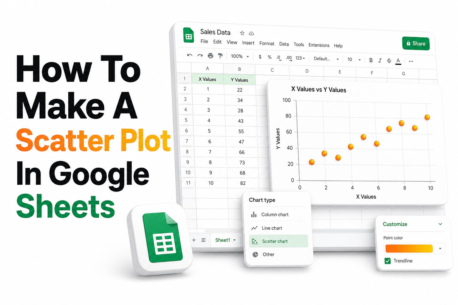
A scatter plot helps show the relationship between two sets of numeric data. In Google Sheets, it is useful for comparing values such as sales and ad spend, study time and test scores, or price and demand.
The chart works by placing one variable on the horizontal axis and another on the vertical axis. Each row in your spreadsheet becomes a point, making patterns easier to see than they are in raw numbers.
This guide explains how to make a scatter plot in Google Sheets using clean data, proper chart settings, and practical formatting choices. It also covers trendlines, labels, common errors, and ways to make the chart useful for readers.
Prepare Your Data First
Before creating the chart, arrange your data in two clear columns. The first column should contain the x-axis values, and the second column should contain the y-axis values. Both columns should use numeric data.
Add short, descriptive headers above both columns. For example, use Monthly Ad Spend and Monthly Sales instead of vague labels like Column A and Column B. Clear headers help Google Sheets assign chart fields more accurately.
Remove empty rows, merged cells, symbols, and text mixed with numbers. A scatter plot depends on clean numeric pairs, so inconsistent formatting can cause missing points, incorrect axes, or a chart that does not reflect your data properly.
Quick setup checklist
- Place x-axis values in the left column.
- Place y-axis values in the right column.
- Use one row for each data pair.
- Add clear column headers.
- Remove blank rows inside the dataset.
- Format numbers consistently.
- Avoid merged cells in the selected range.
- Keep notes or comments outside the chart range.
Create the Scatter Plot
Select the full data range, including the column headers. If your data is in columns A and B, highlight both columns only as far as the rows that contain actual values. Avoid selecting unrelated totals or notes.
Go to Insert, then choose Chart. Google Sheets will create a chart automatically. If it does not choose the correct chart type, open the Chart editor on the right side of the screen.
In the Setup tab, open the Chart type dropdown and select Scatter chart. Google Sheets will convert the selected data into points, using the first selected numeric column for the x-axis and the second for the y-axis.
Choose the Correct Axis Data
The x-axis should usually represent the independent variable, which is the value used for comparison or measurement. Examples include time spent, price, distance, temperature, budget, or another input that may affect the result.
The y-axis should usually represent the dependent variable, which is the value you are measuring against the x-axis. Examples include revenue, conversions, test scores, output, growth rate, or customer count.
If the chart looks reversed, return to the Chart editor and review the X-axis and Series fields. You can adjust the selected ranges there instead of rebuilding the chart from scratch.
Useful axis examples
- Advertising spend on the x-axis and sales revenue on the y-axis.
- Hours studied on the x-axis and exam scores on the y-axis.
- Product price on the x-axis and units sold on the y-axis.
- Website traffic on the x-axis and leads generated on the y-axis.
- Temperature on the x-axis and energy usage on the y-axis.
Customize the Chart Title
A clear title should tell readers what the chart compares. Instead of writing Scatter Plot, use a title such as Ad Spend Compared With Monthly Sales or Study Time Compared With Exam Scores.
Open the Customize tab in the Chart editor, then expand Chart and axis titles. Select Chart title from the dropdown and enter a useful title that matches the story your data is meant to show.
Keep the title short, direct, and readable. A strong chart title helps readers quickly know what they are looking at without needing extra explanation beside the chart.
Format the Horizontal Axis
The horizontal axis should be easy to read and scaled properly for the data. In the Customize tab, open Horizontal axis to adjust labels, text style, and scale options when needed.
If your values are large, use shorter number formats in the spreadsheet first. For example, format currency values consistently or round long decimals so the axis does not become crowded or difficult to scan.
You can also set minimum and maximum values if Google Sheets creates too much empty space. This is useful when all data points sit within a narrow range, making the pattern appear flatter than it really is.
Axis formatting tips
- Use consistent number formats before building the chart.
- Avoid long decimals unless precision matters.
- Set minimum and maximum values when the scale feels too wide.
- Keep axis labels short and specific.
- Use currency or percentage formatting only when it matches the data.
- Check that axis labels do not overlap.
Format the Vertical Axis
The vertical axis should represent the result clearly. Open Vertical axis in the Customize tab to adjust scale, label style, and number formatting. Make sure the range supports the message of the chart.
Avoid shrinking the vertical range too aggressively, because it can exaggerate small differences. At the same time, a range that is too large can hide meaningful movement between points.
When the data includes zero, decide whether showing zero helps readers. For some comparisons, starting at zero provides context. For other datasets, a focused scale may make patterns easier to see without distorting the result.
Add Axis Titles
Axis titles make the chart easier to read, especially when it appears in a report, presentation, or shared spreadsheet. A scatter plot without axis titles often forces readers to guess what each value means.
Go to Customize, then Chart and axis titles. Choose Horizontal axis title and enter the name of the x-axis variable. Then choose Vertical axis title and enter the name of the y-axis variable.
Use labels that include units when helpful. For example, write Ad Spend in USD, Study Time in Hours, or Conversion Rate in Percent. Units reduce confusion and make the chart more useful outside the spreadsheet.
Good axis title examples
- Monthly Ad Spend in USD
- Monthly Sales Revenue in USD
- Study Time in Hours
- Exam Score in Percent
- Product Price in USD
- Units Sold
- Website Sessions
- Leads Generated
Add a Trendline
A trendline helps show the general direction of the relationship between two variables. It can reveal whether the data tends to rise, fall, or stay mostly flat as the x-axis value changes.
Open the Customize tab, then expand Series. Check the Trendline option. Google Sheets will add a line through the plotted points, making the broader pattern easier to see.
You can also show the R-squared value when useful. This number gives a quick sense of how closely the trendline matches the data, though it should be interpreted carefully and not treated as proof of cause.
Use Labels and Legends Carefully
Data labels can help when you have only a few points, but they can become messy when the chart has many rows. Use labels only when each point needs direct identification.
A legend is useful when the chart contains multiple series. If your scatter plot compares only one pair of variables, the legend may not add much value and can be removed for a cleaner layout.
For multi-series charts, name each series clearly in your spreadsheet headers. Google Sheets uses those headers in the legend, so strong column names improve the finished chart without extra manual editing.
Improve the Visual Style
A scatter plot should be easy to scan. Use simple point colors, readable text, and enough spacing around the chart. Avoid heavy decoration that distracts from the relationship between the values.
In the Customize tab, open Series to adjust point size, color, and shape. Larger points work well for small datasets, while smaller points are better for charts with many observations.
You can also adjust gridlines under Gridlines and ticks. Light gridlines can help readers estimate values, but too many lines make the chart look busy. Keep the style clean and focused on the data.
Style choices that work well
- Use one strong color for a single data series.
- Use distinct colors for multiple data series.
- Keep point size moderate.
- Use a readable chart title.
- Reduce unnecessary gridlines.
- Avoid overly bright color combinations.
- Keep labels visible on mobile screens and shared documents.
Add More Than One Data Series
Google Sheets can create a scatter plot with multiple series when you have several y-value columns compared against the same x-axis. This is useful for comparing groups, products, regions, or campaigns.
Place the shared x-axis values in the first column. Add each y-value series in the columns to the right. Select the full range before inserting the chart, including all relevant headers.
After creating the scatter plot, check the Setup tab to confirm each series is assigned correctly. If a column is missing, use Add series and select the proper range from your sheet.
Fix Common Scatter Plot Problems
If Google Sheets creates a line chart instead of a scatter plot, open the Chart type menu and choose Scatter chart manually. This is one of the most common issues when the data resembles time-based reporting.
If points are missing, check for text inside numeric columns. Values such as $500 typed as text, numbers with extra spaces, or cells containing notes can prevent points from appearing correctly.
If the axes look wrong, review the selected data range. The first numeric column should be used for the x-axis, while the related numeric values should appear as the plotted series.
Common fixes
- Change the chart type to Scatter chart.
- Remove text from numeric columns.
- Delete blank rows inside the selected range.
- Check the X-axis field in the Setup tab.
- Reformat numbers as plain numbers, currency, or percentages.
- Remove unrelated totals from the selected range.
- Rebuild the chart from a clean two-column dataset when needed.
Use Scatter Plots for Better Reporting
Scatter plots are useful when a table alone does not show the relationship clearly. They help readers see clusters, outliers, direction, and spread with less effort than scanning dozens of rows.
In marketing reports, scatter plots can compare spend and revenue, traffic and leads, or email volume and conversions. In education, they can compare study time and performance. In operations, they can compare wait time and satisfaction.
If your spreadsheet includes supporting calculations, connect readers to your Google Sheets formulas guide for cleanup and analysis steps. You can also link to a data visualization best practices guide when explaining chart choices.
Read the Pattern Correctly
A rising pattern from left to right suggests a positive relationship. As the x-axis value increases, the y-axis value tends to increase as well. This can be useful for spotting growth-related patterns.
A falling pattern suggests a negative relationship. As the x-axis value increases, the y-axis value tends to decrease. This may appear in price-demand analysis, error reduction tracking, or efficiency comparisons.
A scattered pattern with no clear direction suggests a weak relationship. The two variables may not be closely connected, or other factors may be influencing the result more strongly than the values shown.
Avoid Misleading Conclusions
A scatter plot can show a relationship, but it does not prove that one variable causes another. Two values may move together because of a third factor, timing, seasonality, or coincidence.
Use the chart as a starting point for analysis, not the final answer. If the pattern looks strong, review the raw data, check for outliers, and compare it with business context before making decisions.
Be careful with small datasets. A chart with five or six points may show a pattern that changes completely once more data is added. More observations usually give a more reliable view.
Practical review steps
- Check whether the dataset is large enough.
- Look for outliers that affect the trendline.
- Compare the chart with business or research context.
- Avoid claiming cause from correlation alone.
- Review whether missing data could change the pattern.
- Confirm that units and dates are consistent.
- Use notes beside the chart when extra context matters.
Export or Share the Chart
Once the scatter plot is ready, you can share it inside the Google Sheet or use it in another document. Click the chart, open the three-dot menu, and choose options such as Copy chart or Download.
When pasting into Google Docs or Slides, you may be able to link the chart to the original spreadsheet. This makes updates easier when the source data changes later.
If you download the chart as an image, review the size and readability before publishing. Small labels, crowded points, and unclear titles can become harder to read once the chart is placed inside a blog post or report.
Conclusion
A scatter plot is one of the simplest ways to compare two numeric variables and spot patterns quickly. With clean columns, correct axis choices, readable labels, and a helpful trendline, Google Sheets can turn raw data into a clear visual.
The process starts with preparing paired values, inserting a chart, selecting the scatter chart type, and refining the design. Good titles, axis labels, and formatting choices make the chart easier to read and more useful for reports.
Learning how to make a scatter plot in google sheets helps writers, analysts, marketers, teachers, and business teams present relationships in data with clarity. The chart works best when the data is clean and the conclusion stays grounded in the numbers.
FAQ
Can I make a scatter plot with three columns
Yes, you can use three columns when one column acts as the x-axis and the other two columns become separate data series. This helps compare two related outcomes against the same independent variable in one chart.
Why is Google Sheets showing a line chart
Google Sheets sometimes chooses a line chart automatically when the data looks time-based or sequential. Open the Chart editor, go to the Setup tab, and change the Chart type to Scatter chart manually.
Can I add a trendline to a scatter plot
Yes, you can add a trendline from the Customize tab. Open Series, turn on Trendline, and adjust the style if needed. You can also display the R-squared value for extra statistical context.
Why are points missing from my chart
Missing points usually happen because some cells contain text, blanks, symbols, or inconsistent number formatting. Check the selected range, clean the numeric columns, remove blank rows, and confirm each row has a valid data pair.
Is a scatter plot good for SEO reports
Yes, a scatter plot can support SEO reports when comparing two numeric metrics, such as content length and traffic, backlinks and rankings, or impressions and clicks. It helps show patterns that tables may hide.
0 Comments